

OshNoc
When working on the design team at DealerSocket, we were each asked to create a logo, pro bono for an IT department within the company. The project was open ended. I worked through a few iterations until I came across a mark that conveyed motion. This is a simple combination mark, that includes a tightly kerned san serif font with a computer buffering symbol, strategically placed around the “O” to create a focal point. This horizontal mark is clean, simple and can be used in a myriad of applications.


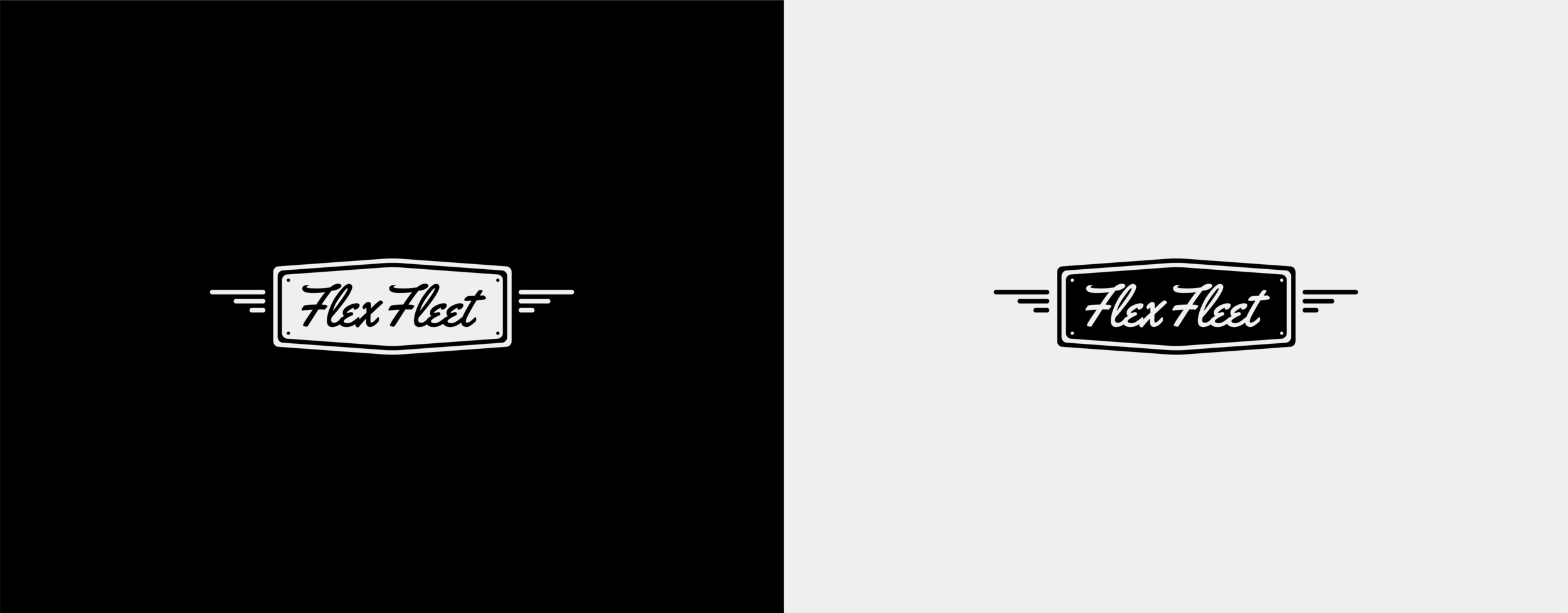
Flex Fleet
Flex Fleet is a truck and service vehicle rental company. This was a one-off task, that was initiated, but not further directed by the client. It then later evolved into a personal project. The badge and protrusions have a rounded aspect that meld well with the playful, hand drawn font. The emblem captures motion. I think it is successful because it is a dynamic badge that works well as a stamp on light and dark backgrounds.

Hopnosis Pub N Grub
I was hired to re-work a pictorial design for Rule of Design Inc’s client, Hopnosis Pub N Grub. This project was a challenge. The bar owner had seen a former illustration that didn’t quite meet the mark, and there were many specifics for this design. The character needed to be a hops flower, but have a diamond aspect to it’s aesthetic. The client had provided an example of what they wanted. They asked that the character have sunglasses and provided swirling pupil designs to be placed within it’s eyes. The face was to also have a “Chester Cheetah smile”
I initially worked through one iteration of the new character, but was having a hard time settling on an iconic mark until two aspects of the re-design came into place. One being that the hops flower worked the best with the point being at the bottom. This created more of a head shape, where the point alludes to a neck, or a beard. The second alteration I made was to enlarge the sunglasses. This gave the character life. The use of linear marks to form diamonds adds a geometric touch and texture, while the composition of the face makes the character’s expression quite captivating. I choose to show this mark because it displays the success of iconic, illustrative logo design in an environment that does not allow for much wiggle room.


Amelia Grace Music
Amelia Grace is an aspiring young musician. She wanted her logo to be retro and indie, while incorporating earth tones. Our goal was to create a mark that would be a start in her music career, helping to define her brand on social media as well as assist in merchandise sales. My initial process started with sketching thumbnails after creating a mood board of retro marks. I then presented three comprehensive logos. I decided on a hand drawn font for the word mark, because it gives a handmade touch to the design, characteristic of an indie look and feel. What gives the logo a dynamic touch is how the circular badge corresponds with the slight offset angle of the word mark. This was a fun project that really came to life as a strong emblem mark.

