

Personal Logo Design Process
The logo below was designed for my personal brand, which I’ll use as an example to show you my steps in designing a logo from start to finish. The logo is a monogram that simply combines my initials “MW.”. I will be outlining each phase into completion and explaining my design decisions along the way. Phase one can be thought of as the exploration phase. This consists of sketching out multiple thumbnails. In this case, I created 50 initial thumbnails, and then further developed four of my favorite thumbnails until I rendered it down to two comprehensive designs.


Phase two requires both practical and intuitive decisions to be made. First, I chose two sketches that both jump out to me and that I think will function well. The logos I chose were both visually appealing, but also represent one solid mark that I know I can develop to be legible at any given size. In this case, I was attracted to the two thumbnails that combine each letter where they begin. I further developed the chosen monograms with geometric marks using a t-square, triangle and compass. Lastly, the lines were filled in to create two comprehensive designs. The “M” merges at it’s baseline with the “W” stacked below it, merging at it’s cap height. The fusion of the two letter forms at the left creates one mark that speaks in many different ways. The gap at the right allows your eye to distinguish the letter forms. The letters then appear as a reflection of each other, creating symmetry. They also stand alone, creating a new shape not only with the letter forms but also within their negative space.
The third phase consists of deciding on one comprehensive design and developing it into the final logo. I chose the design with guidelines that run along a perpendicular, linear grid. The letterforms combine in a harmonious way compared to the other design because the ascenders with the letters create symmetry within the mark.


After the monogram has been finalized, the mark is then combined with a wordmark in certain applications. The wordmark combination is helpful to the viewer because it provides context by helping to distinguish the identity of the brand. In this last phase, I experimented with a few reverse applications and came upon solidifying the lettermark within a square outline, rather than a stark white box on a black background. The final versions then serve as a stand alone lettermark and a horizontal combination logo both in black and reverse.


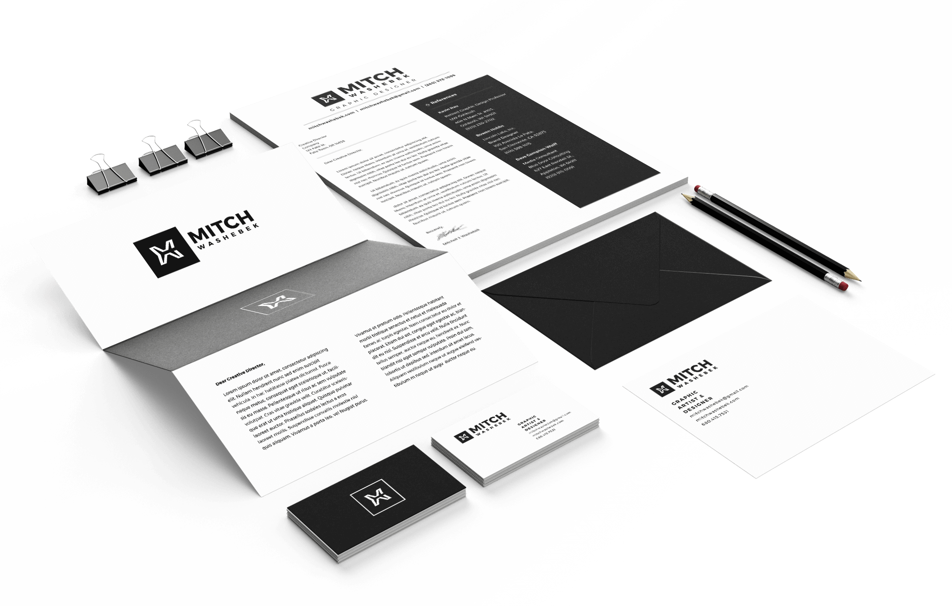
Business Cards
Now I’d like to show you how I came to applying the logo combinations to a business card and how I went about designing them. First, I started with a mood board, where I gathered inspiration for the design.

The second phase required me to think more critically about how the layout would look. In this step, I also made sure to jot down any other ideas I had for colors and treatment of the background.


I ultimately decided on a simple black and white design. The lettermark stands alone on the front. The back displays the combination mark as a focal point with my personal information running along a vertical grid line, connecting the two elements within the layout. For me, the white negative space does not only distinguish each chunk of text but also serves as a place for written notes.
