Brand Identity • Visual Strategy • Design Systems
Tender Retail: Scalable System for Global Payments
Executive Summary
I led the visual identity overhaul for Tender Retail to transition their brand from an outdated hardware-focused look to a modern, software-first aesthetic. This resulted in a comprehensive, scalable design system that unified their global payment middleware solutions across retail and QSR platforms.
The Challenge
Tender Retail’s original branding relied on a literal pictorial mark of a chip reader, which felt dated as the company shifted toward sophisticated middleware software. The brand lacked a cohesive system, making it difficult to maintain visual consistency across their expanding suite of digital payment products.

The Solution
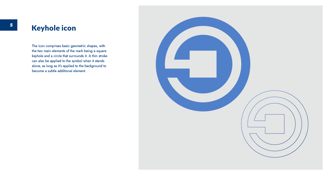
I developed a symmetrical, key-hole-inspired combination mark that symbolizes security, access, and fluid movement—essential pillars for a payment gateway.
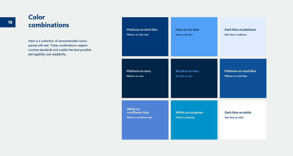
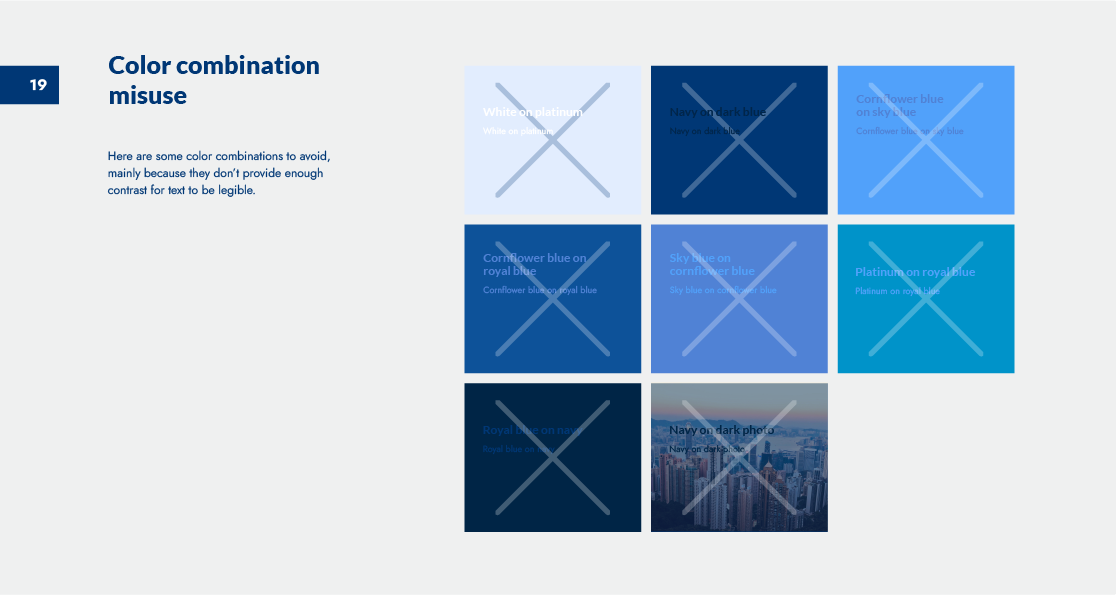
Visual Strategy: Shifted to a professional, trust-focused blue analogous palette to align with fintech industry standards.
Systemic Thinking: Implemented a typography system using versatile Google Fonts to ensure ease of implementation for the engineering team.
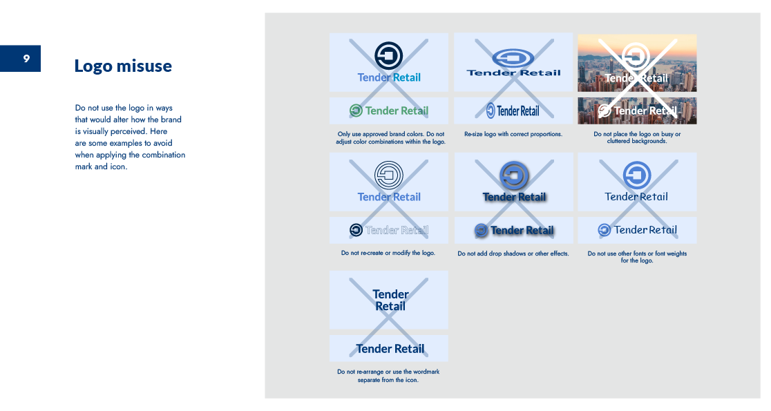
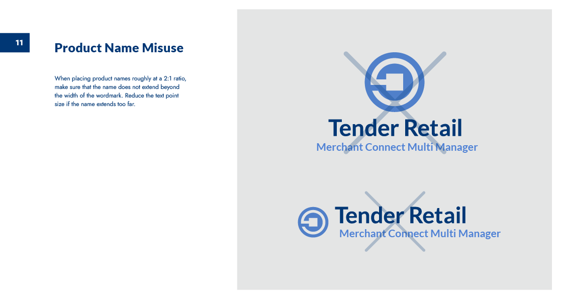
The Deliverable: A centralized brand guide that defined every element, ensuring the new identity could be applied to everything from software UI to physical retail environments.


The Result
The rebrand was successfully shipped and adopted as the primary identity for Tender Retail’s global operations. By delivering a clear brand guide, I empowered internal teams to deploy new marketing materials and UI updates faster, significantly reducing design-to-production friction.